


User Experience / Case Study / User Interface
The Oxford Botanical Gardens is a beautiful historic garden, but its current branding and user interface do not reflect the amazing experience the gardens provide in person. This case study will evaluate the user experience and use background research to develop a new digital strategy to give its online presence new life.

Background
Oxford Botanic Garden, founded in 1621, is the UK’s oldest botanic garden. The Garden is dedicated to educating people about plants, helping plant conservation, supporting education and research, and creating public engagement to inspire visitors.
Heuristic Analysis
Heuristics: a method of solving problems by finding practical ways of dealing with them, and learning from past experience. I used Jakob Nielsen's 10 Heuristics to analyze Oxford Botanical Gardens' usability for their current design. 
1. Aesthetic and Minimalist Design
The abundance of pages in Nav Bar makes it confusing to find the information you need2. Aesthetic and Minimalist Design
The width of the text is too long making it hard to read. Also, repetitive dialogue3. Match System and the Real World
The language for the types of tickets is inconsistent and confusing4. Error Prevention
The types of tickets are linkable but all link to the same page which can cause confusion5. Match System and the Real World
Only some of the photos portray the section they are linking to6. Aesthetic and Minimalist Design
The footer is too crowded - making it hard to find relevant information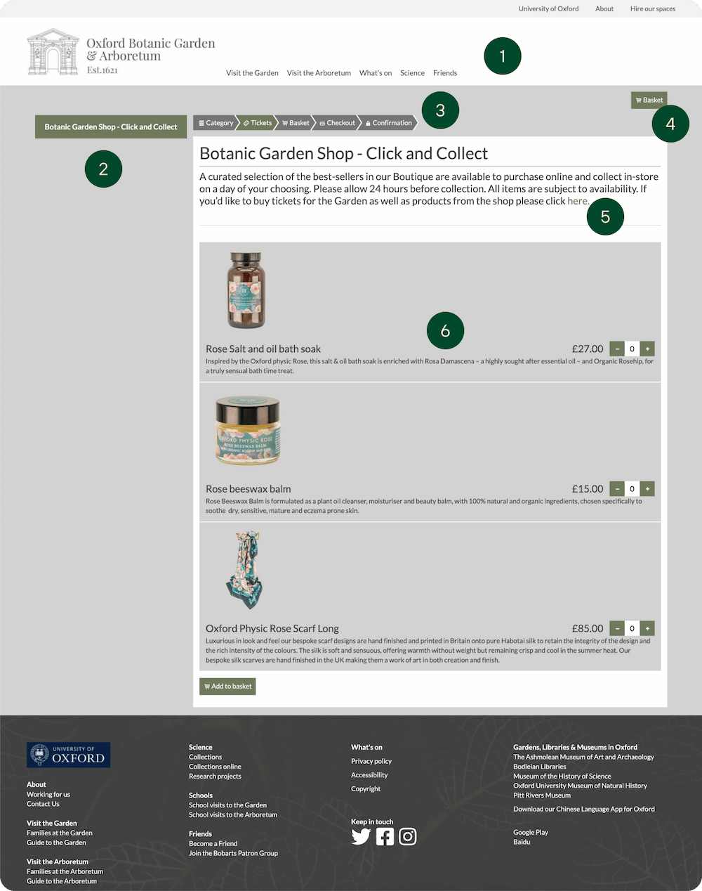
1. Consistency and Standards
The Header, Nav Bar, and Footer are not consistent in the website and e-commerce2. User Control and Freedom
User can not go back to the previous page easily3. Match System and the Real World
The language for ticket is confusing when trying to buy a product4. Recognize and Recover from Errors
"Your basket is empty" error is confusing and provides no clarification5. Error Prevention
The link leads to the Home page which does not have e-commerce features6. Match System and the Real World
Shop page has links for individual products but they all lead to this main pageUser Research
To collect quantitative and qualitative data, I created a user survey completed by three of my classmates who also went to Oxford Gardens.
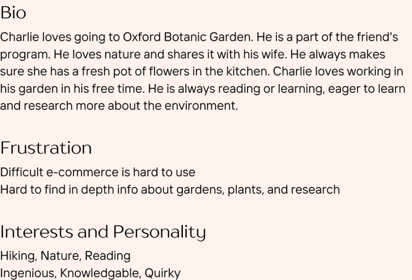
User Personas


Competitive Analysis
I examined seven different indirect and direct competitors of Oxford Gardens to understand the expectations, gauge competitors, and see how they address our needs. 
Features and Goals
Cohesive IdentityCreate a more engaging interface to match the in-person experience
Add Plant Database
Encourages education and supports their values
E-commerce
Intuitive design for tickets and shopping
Reorganize Info
Limit and reorganize info to be more user friendly.
Card Sorting / Information Architecture
Before designing individual screens, I needed to reorganize the website information architecture to be more intuitive and user-friendly. I conducted a card sorting activity with some peers to analyze what cards users grouped together to inform how the update information architecture should behave.Card Sorting
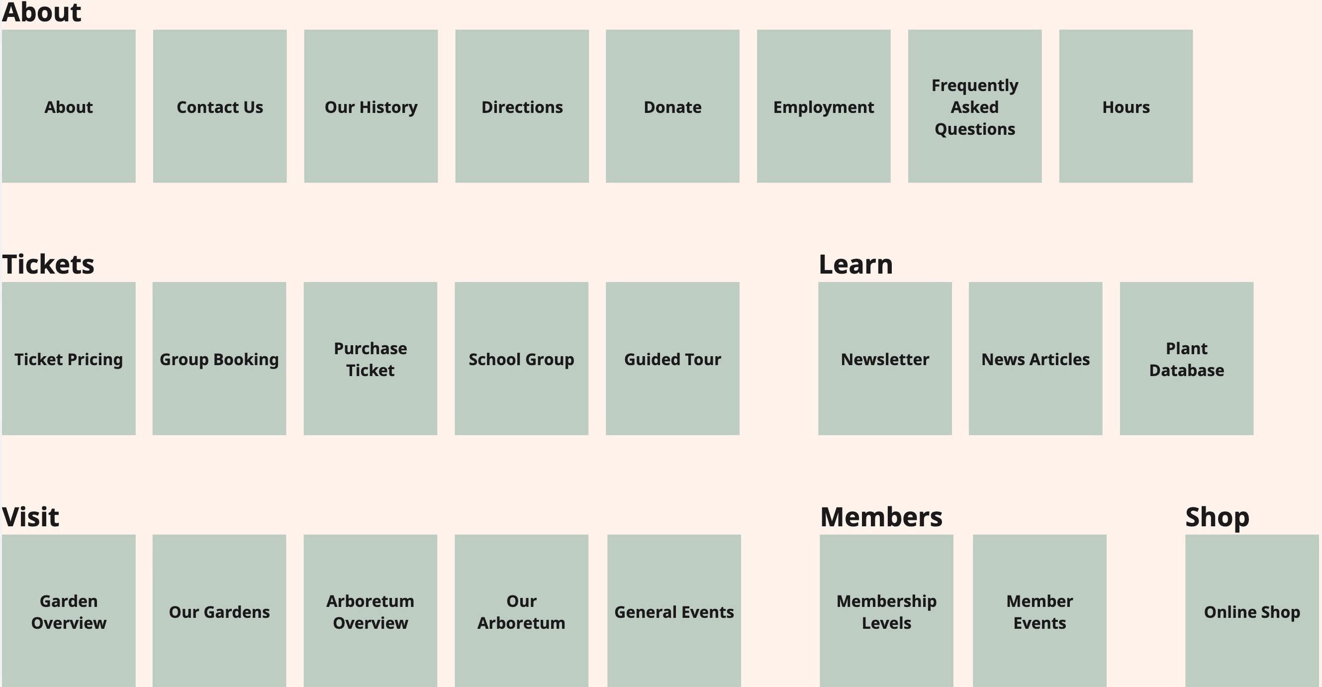
Information Architecture

Low Fidelity Sketches
Next, I started to do sketches of segments of the website to understand how blocks of elements work together.
Branding
The new website will consist of a new type selection and color structure that meets at least AA accessibility standards. The 12-column grid system provides structure and contestability throughout the website design.

High Fidelity
Home Page

Garden Page
