Typography / Editorial Layout / User Interface
Variety is a media company presenting editorial articles on topics such as film, music, and TV. Their current interface for articles features a large set of typographic styles creating an overwhelming experience. The revamped website layout features an explorative layout and a more unified typographic stack.

Original Layout
The original layout of this editorial article featured 17 different typographic styles. This large type stack makes the hierarchy of the page unclear and leads the article to feel cramped and overwhelming.Original Article and Recreation


Typestack - Recreation
Edited Layouts
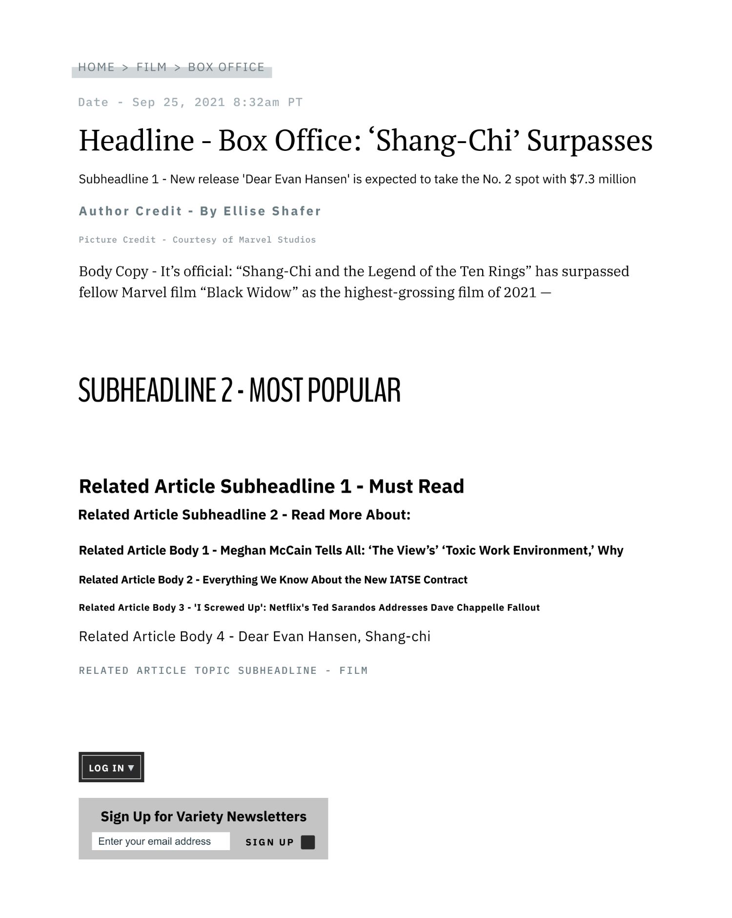
In the three edited layouts, I aimed to create a more cohesive type stack to better guide the readers through the hierarchy of the page. I limited the typographic styles, but I also aimed to keep almost all of the original content, adding extra elements as necessary. My goal through the different departures was to break away from the cramped compact feel of the original article layout while still keeping the style and feel of Variety.Mild Departure

Moderate Departure

Radical Departure
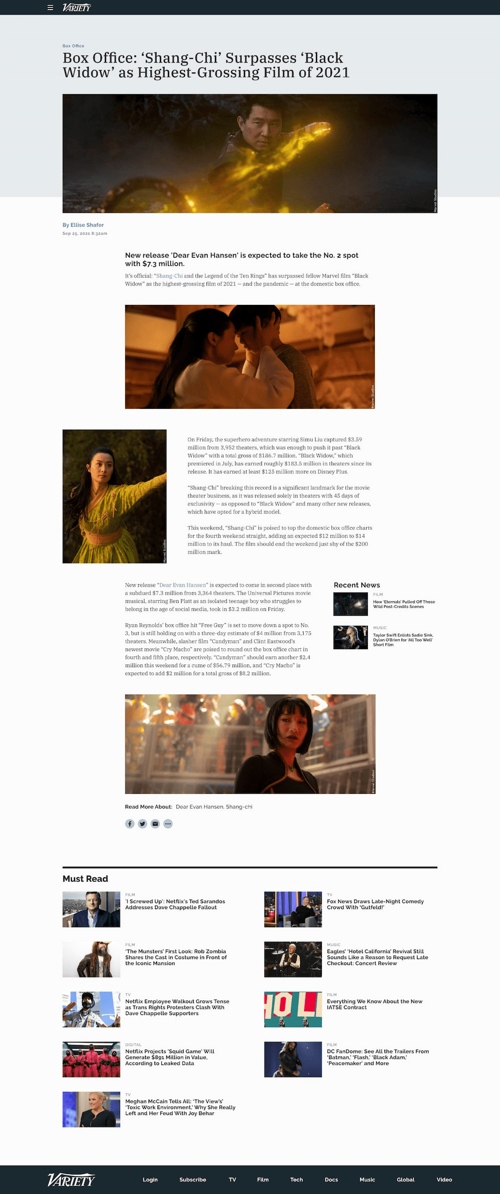
Final Layout
The radical departure felt the most visually interesting of the three layouts. I added more photos and some call-outs on the side to make it more visually appealing and to break the boundaries of the width. This allowed me to break up the type and add more vertical spacing.Final Mockup
Final Typestack